From agency to unicorn - the typeform story.
Reverse engineering lessons from Typeforms growth strategy.
Friends,
Typeform has quietly become a $935 million company. While competing with the likes of Google & Mailchimp. This year, it will join the unicorn club.
But how did they grow so fast? I wanted to discover their secret. Here's what I found:
Brought to you by:
Get 21% more users from your SaaS landing page with MarketCurve. Refine your messaging, positioning & create eye catching designs your customers will love. .
Typeform embodies the spirit of building to scratch your own itch.
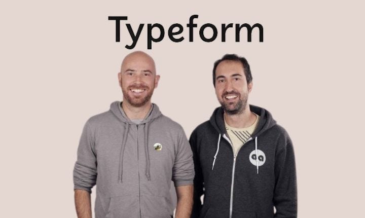
The founders David & Robert were running their own design agencies in Barcelona & partnered on a project together.
The deliverable?
Building a sleek contact form to collect leads Just like that, Typeform was born.
David & Robert shopped around for solutions but they didn't like what they found.
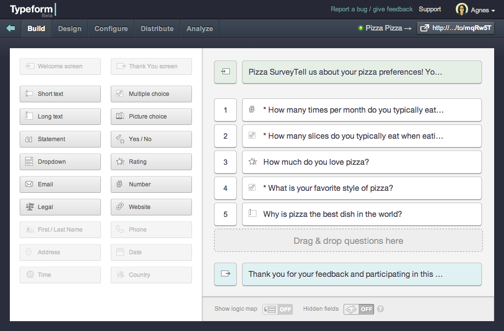
So they decided to completely redesign the experience of collecting info.
They followed one simple mantra: Make form-filling an enjoyable experience that emulates a real conversation.
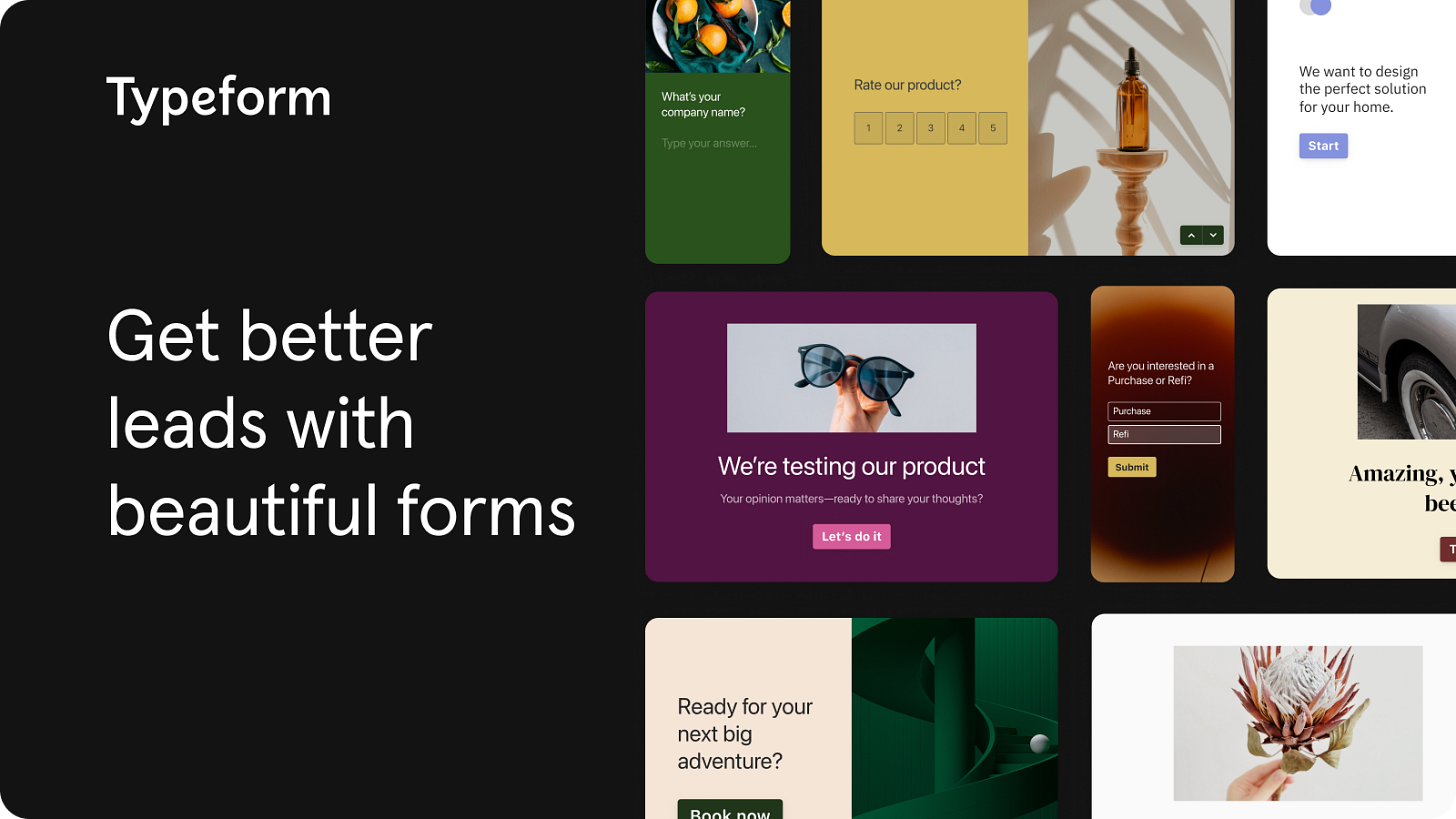
Typeform stood out via its positioning & user-focused design.
Typeform was positioned to enable any person to create a form his audience will love to fill out.
With this strong positioning + user-focused design, Typeform took off.
In October 2012, Typeform released a teaser video on Betalist.
It went absolutely viral and got Typeform its first 1000 users.
Typeform leveraged growth loops very early on.
Users created Typeforms & then shared those with their communities.
Each form had a “Powered by” button & was hosted on the Typeform subdomain.
The growth flywheel kicked in & by February 2014, Typeform had reached 50k users.
In 2013, Typeform raised a seed round & set up a paid tier.
It was set at $120/yr and $25/mo. They offered a 50% discount for anyone upgrading to a yearly plan.
In month 1, Typeform had 1000 paying users & it was time to put on the foot on the gas.
Typeform expanded its team with the goal to make their growth loops 10x more impactful.
Their virality coefficient was impressive.
Every two new sign-ups generated an additional sign-up.
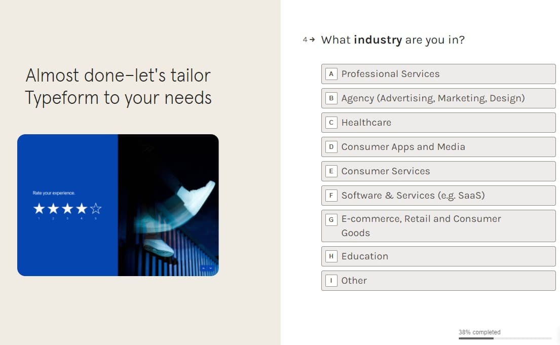
The next step was to optimize the onboarding funnel for their new signups.
After AB testing with the powered by CTA, Typeform finalised the copy as " Create your own Typeform".
They got 200% more users just from this one small CTA change.
Typeform optimized their thank you page with the new CTA ¨create your typeform".
Users could now create a Typeform without even signing up, reducing friction in the user journey.
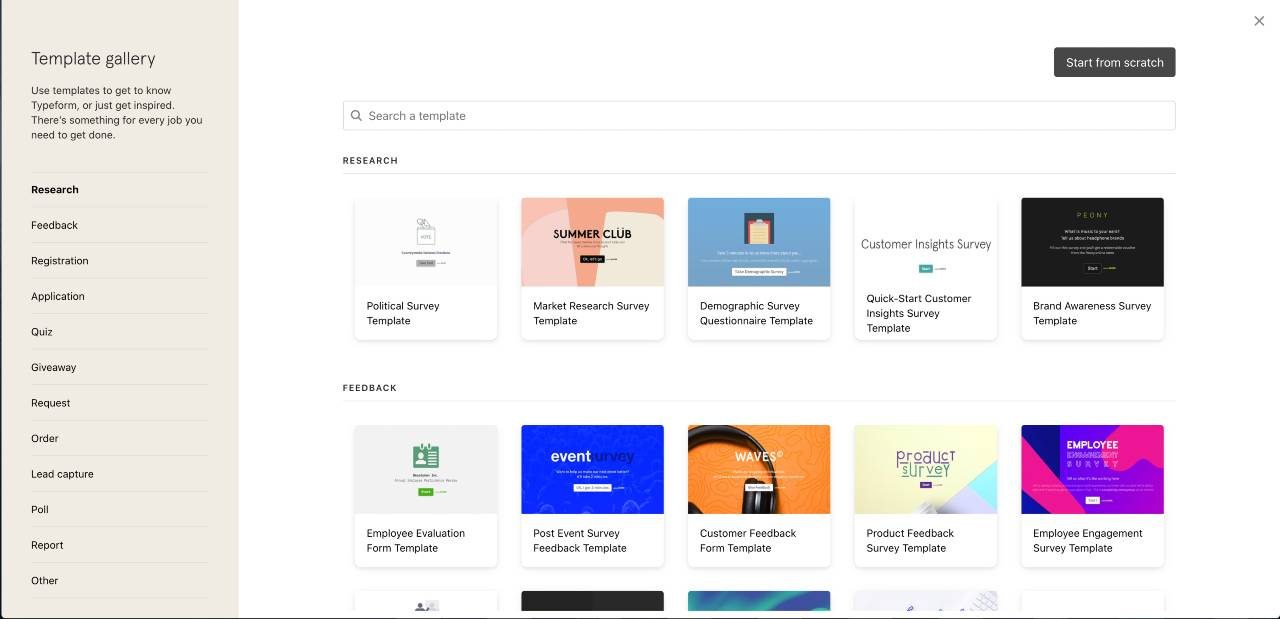
They started creating Typeform templates which brought them significant long-tail SEO juice.
Typeform had a lot more new users but no increase in active users.
So David & his team went all in to build the Typeform brand.
They quantified their marketing efforts & operated by a simple mantra - Generate brand awareness & increase sign ups.
Typeform built brand awareness by doing 3 things:
Invested heavily into organic & paid search
Created editorial content and social media.
Doubled down on their template library, which became the focal point for their PLG efforts.
Created tutorials, guides & resources
Partnerships with agencies & tech stakeholders was an integral part of Typeforms growth efforts.
In 2019, Typeform hired a new CRO to lead their sales efforts.
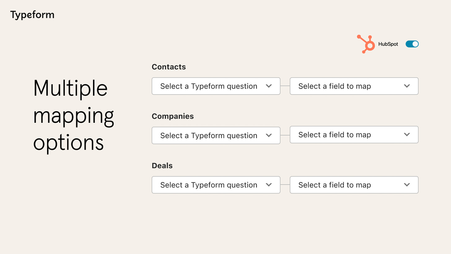
They moved upmarket to grow with bigger customers like Hubspot & have a better retention curve.
Typeform launched an in-house product design & development studio called Typeform Labs.
This is where they experiment with new products under the Typeform brand.
They already have 2 products Videoask & Formless bringing in millions each year.
Video Ask by Typeform is a video-driven data collection product & reached $1m in revenue in the first year itself.
Formless is an AI powered form builder & is gaining momentum too.
Here are 5 lessons to learn from Typeform:
Growth loopS + low signup friction + social sharing = virality
Build something to scratch your own itch.
Build a functional & aesthetic product/brand.
CRO is your 80-20.
Think about your customers and their users when building.
This is it for this long essay.
Phew! I am exhausted.
If you liked this essay, consider sharing this with a friend or share it on Twitter.
If you wanna support this newsletter (and get some high-quality stuff in exchange), there are 5 ways you can do so:
Buyer's Journey Audit - I will go through the self-serve funnel as a buyer would & audit the entire process. Get a PDF report with action-items to optimize your product activation, engagement & retention.
Landing & Pricing Page Assessment - Audit your landing page & pricing page. We will Analyze your page across four core factors & identify opportunities for you to optimize your page for conversions.
The DIY SaaS Landing Page OS - A Notion dashboard to help you ship high-converting landing pages in a step-by-step manner.
Revamp your landing + Pricing Page - Submit your Landing page URL and get a Figma file with a conversion-friendly version of your landing & pricing page.
Design, development & copy facelift for your brand - Get a brand new website designed in Framer/Webflow along with copy delivered in 2 weeks.


