

7 lessons learned from roasting the Stir landing page
Market Curve Issue 45 (Season 3 Episode 2)

Hello friends,
Welcome to Season 3 Episode 2 of the Market Curve newsletter.
Today I'm going to do a teardown of the Lemon Squeezy landing page.
I'm going to share 7 lessons from their landing page that you can then apply to your own startup’s landing page.
Let’s dive in.
What the eff is Stir?
Stir is a tool that helps creators collaborate together and make money doing so. It offers a whole host of features that helps creators manage their business while they focus on the creative side of things.
With that background out of the way, let's get into the 7 lessons I’ve learned from the Stir landing page.
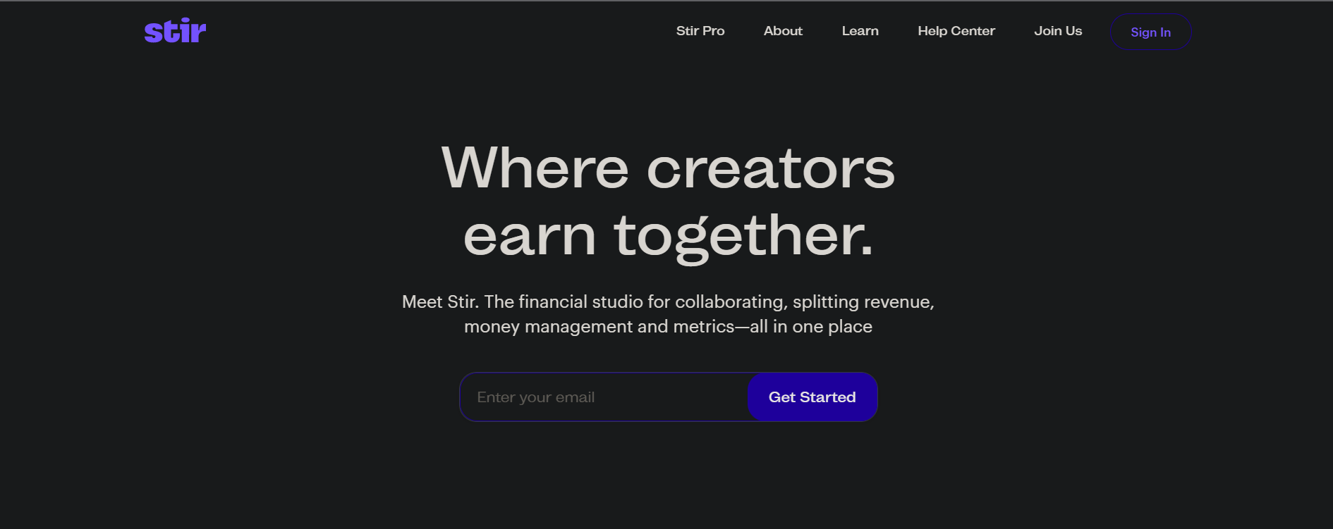
Lesson 1: Communicate your product’s core value prop in the headline
Let’s look at the headline here → Where Creators earn together. This is a very nice headline and it gives me an idea of what stir is. It’s a platform where creators earn together.
But there is more to it. Stir doesn’t just help creators earn together. It also enables creators to collaborate on things together, split money between them, send invoices, and get paid. There’s 2 elements to Stir: Creators can work together and make money together. In this headline, there’s only one of these 2 themes mentioned → which is making money together

Ideally, the headline should bring the product’s core value prop under one solid sentence
I would replace the existing headline with → Work and make money with other creators

That would make it more impactful and communicates Stir’s value proposition in a very concise yet impactful way.
Lesson 2: Mention your product’s core benefits in your hero sub-headline.
The second section of the Stir landing page is the sub-headline:

Meet stir - the financial studio for collaborating, splitting revenue, money management, and Metrics all in one place. This is great. I like the sub-headline a lot because it says that there are four main things under the Stir product → that is collaboration, splitting the revenues, money management, and metrics and analytics.
These 4 sub-themes serve as a nice skeleton for the entire landing page structure. Where the rest of the sub-themes are explained in greater detail in the subsequent sections of the landing page.
Stir acts like a one-stop shop for all creators - they focus on building stuff while the rest of the business side of things is just taken care of by Stir.
Ideally, I would include not just these features but also go a step further and explain how these features would make creators’ lives easy.
So if I were Stir, I would write something like → Stir makes it easy for creators to work together and make money. To manage finances and understand key metrics. So you can run your creator business smartly and professionally

Lesson 3: Keep your value proposition headline and sub-headline in sync
The copy in this section reads → get creative with others in just a split. Split the revenue on a video, a line of merch, or the latest and greatest podcast. The possibilities are endless when you share the upside together.

I'm not sure what the headline is trying to convey here. It is trying to say that okay, I am creating with others. So I get that there is some element of collaboration involved but I'm not sure what that is.
So am I trying to collaborate with others on the creative side or am I trying to collaborate with others so I can make more revenue or am I collaborating so I can split the revenue? The definition of the word “split” is also undefined.
All in all the headline seems ambiguous - It shouldn't require any cognitive burden on the side of the reader or your potential customer to understand what you’re trying to say.
The subheadline is super fun to read - “split the revenue on video line of Merch or the latest and greatest podcast”. So here I'm understanding, okay, it's talking about splitting the revenue
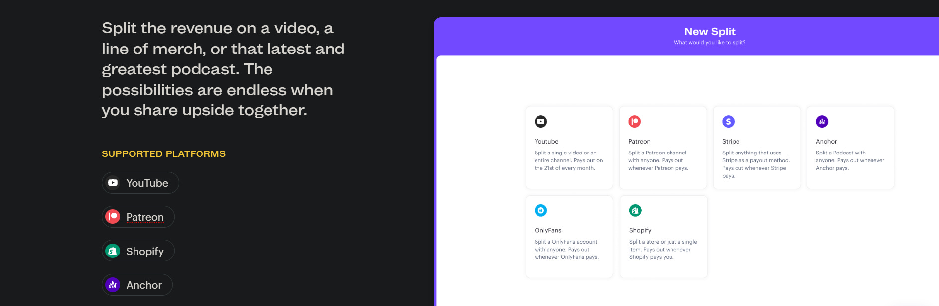
.
So here the headline theme should be about splitting the revenue because that is what the value proposition is. You gotta make sure your value proposition headline and subheadline stay in sync with regards to the corresponding theme.
Which in this case is → splitting revenue
So If I were Stir, I would rewrite the headline to say something like → Split money easily with other creators. And keep the sub-headline as is

Lesson 4: Make your value proposition headline as concise and clear as possible.
If we scroll down, we see the value proposition statement for YouTube teams. The headline says “Give credit, get credit”. I'm not sure what it means.
If I'm looking at this page for the first time, I have no idea what it means. And neither is there any data to suggest what it is. I have a screenshot, but I have no clue what it is trying to say. So it's very unclear

I would make the headline super clear and concise as to what the corresponding benefit actually is. I would get rid of this vague headline “give credit. Get credit”.
Lesson 5: Use consistent UI/UX structure for your value proposition section.
In the previous value proposition section, there was one small headline, one large headline, one subheadline, and then a card-based format. And in this section, there is one headline, and there is no subheadline. And two CTAs.

The structure just seems very randomly arranged. It does not make for a clean user experience.
Lesson 6: If you have multiple features under a value proposition, map them out neatly.
In this section, the value proposition is payments. Under this you have sub-themes like:
Never pay a fee again. Put your one or nine lines on autopilot or awesome, bank to bank, literally seconds, whatever you do business.

This is a very good section and this is a very good practice as well that you have one clear headline and you have those four small sub-features within that broader theme of payments, right? So this is a great practice.
Lesson 7: Bring your features under a common value-based theme
The next section titled “brand deal splits” is in the wrong place. It is tied into the “splitting revenue” value prop we came across earlier in the page. Ideally, this section should have found a place as a sub-theme under the broader theme of “splits”.

There are 2 sub-themes here: one is revenue split, and the other is brand splits.
Ideally, I would club these sub-themes themes together under the bigger split theme. I would then have a sub-headline here, which would expand upon it and would follow a consistent syntax.
Revamp your own SaaS landing page in 3 days
All you gotta do is play a quick 1-min game about your startup. And get your landing page revamped in 3 days.
It’s where man meets machine. We’ve built our own landing page AI writer after working on 200+ SaaS landing pages. We augment this with our human intelligence-powered writers.
The end result? Your landing page has both substance AND style - and is built to get you customers for your SaaS.
Saves you and your team hours of brainstorming.
You build. We tell your story.
No back-and-forth emails, no onboarding, no unnecessary delays. Get an editable Figma file in your inbox with your new copy. In 3 days. Easy-peesy.
Here’s an example of what you can expect:
If you enjoyed reading this teardown, drop your landing page URLs below in the comment section or just reply to this email. I’ll choose one to do a teardown next week.
And don’t forget to spread the word around!