

10 scientific ways to optimize and structure your pricing page
A 3-min essay on how you can use consumer psychology principles to optimize your pricing page to make more $$$.

Hey friends,
Welcome to Issue #24 of Market Curve - a weekly newsletter exploring the intersection of marketing with consumer psychology and behavioral economics. Through Market Curve, I hope to offer marketers and founders a different perspective on how to better understand their customers - one that is rooted in science.
Help me get to 1500 subscribers by the end of August by doing any of the following:
Forward this email to friends, family and peers.
Share within your existing community or Slack channels
Share on LinkedIn, Twitter etc with a short note.
Is your pricing page conversion rate keeping you up at night?
Imagine this scenario:
Your prospects land on your home page, they check out your product and fall in love with it - after all, it's love at first sight. So what do they do with their new found love? They go on to buy it - to make them feel a bit more special.
But when they do go on the pricing page, they realize it's not for them. This relationship won't work out after all.
And you're wondering:
" Is this my fault? Did I do something to tick them off"?
The answer is no. You're doing the best you can. But it wouldn't hurt to make the pricing page a bit more pretty - a bit more engaging.
What if you could create a page where the prospect has no thought other than " I need this right now!"
What if you could create a page where the natural response of your prospect is to say yes.
To do that, you need to get inside the mind of your prospect and understand what they like. Once you do, you can sprinkle your new-found knowledge over your pricing page.
After all, your pricing page is where all your effort of building a relationship with your customer finally reaches climax (via a sale).
In this post, I'll share 10 science-backed ways to optimize and structure your pricing page, with examples.
But before we start, a word from our sponsor:
You know how you struggle with staring at a blank screen for hours trying to come up with words for your landing page copy? Words that are supposed to make your prospects whip out their credit cards and shell over money to you?
Market Curve takes care of that headache for you.
Now you can spend your new found time doing things you actually enjoy (like sleeping).
What’s more is you get your pimping fresh landing page within 3 weeks (without going broke).

Since you’re such a cool reader, I’ve got a surprise for you. For zero dollars, you get a free landing page video audit for your website. Normally it costs 249$, but for you (you wily reader you), I’ll make an exception ;)
All you gotta do is type “Audit” along with your website url and send me an email by pressing the big black button below. And I’ll send you a short video explaining how you can make your landing page a money magnet.
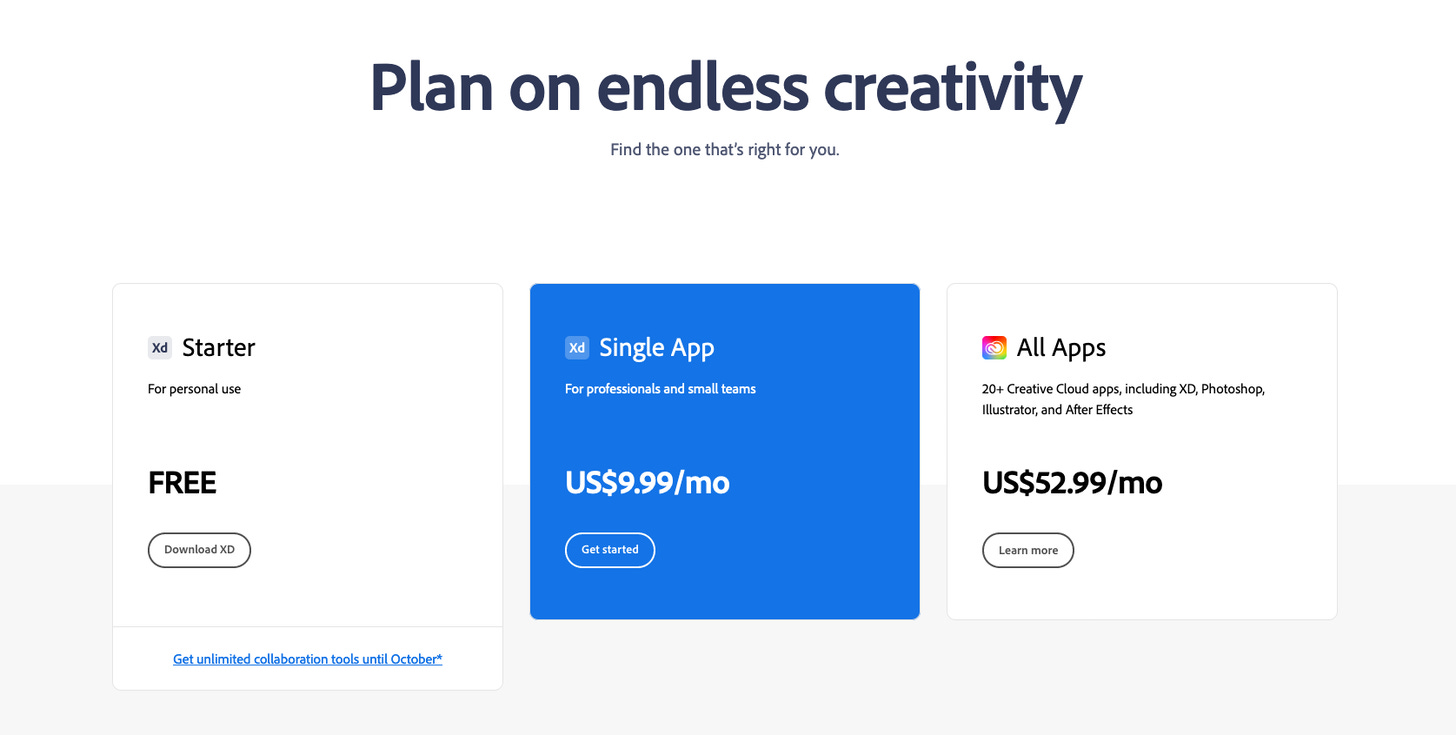
1. Draw your customer's attention to your default pricing.
Default pricing says to your customer - "people just like you are choosing this tier as their default tier. Maybe you should do it too". We like to choose the same things as others because it makes us feel safe in our choices. Not only will it make your customers feel safe, but it will also trigger their loss aversion as they will feel they are missing out on things that people like them are choosing at will.
2. Use offers or discounts on your subscriptions.
If you have a monthly and a yearly plan, show your customer the exact amount they will be saving by signing up to your yearly plan. If you have a limited number of seats available on your course, then you can say something like "Only 10 more seats left". You can do the same for your info products, SaaS subscriptions, etc etc.

3. Show the missing features across all paid tiers.
Comparing and contrasting features across the pricing tiers helps your customers visualize what they will be missing out on. Sometimes we think that we don't need XYZ features but once we actually see those features not included in our pricing plan, our loss aversion bias kicks in. It helps us see what features we will lose out on by not shelling out a few more bucks. Remember, value >> price.

4. Reduce the number of pricing plans available to no more than 3
Offering a maximum of 3 pricing plans will help your visitors make better decisions and feel less overwhelmed. Research shows that customers make more effective and satisfying decisions when less information is presented or when fewer options are on offer.
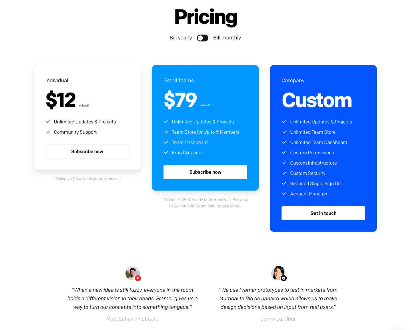
5. Show the features comparison on different tiers.
Show how different tiers compare against each other. Make your customer "see" how they would gain by becoming a paid/premium member. A simple comparison table will allow your visitors to see the features that will most benefit them while eliminating the unnecessary. Make your users feel comfortable and confident by providing a simple and smooth experience.

6. Display a higher pricing first followed by your best value pricing.
In the anchoring effect, the customer will always use the first piece of information as an anchor. Seeing a higher priced service or product in the first instance will create the perception that the subsequent pricing is much cheaper. Your best value pricing will attract the most traffic as a result.

7. Use large numbers as an anchor.
Your pricing page is where your visitors become customers. Just before the pricing block starts, use large numbers saying something like this: "500,000 + people are using our product". This large number will now act as an anchor against your subsequent pricing numbers. As a result, your pricing numbers, though large, will appear smaller in context.

8. Highlight the call to actions on the paid plans
By making the CTA bolder on your paid plans, you draw attention to them right away. If you put equal emphasis on your free plan as well, you put it on the same footing as your paid plans. This decreases the effect of the anchor. By highlighting the paid plans, you prompt your user to notice the paid plans and compare what they'd be gaining from signing up on the paid plan.

9. Show the daily/weekly/per user cost as opposed to monthly cost.
This is a nifty way to lower your customer's perception of the cost they're incurring. Displaying the per user or daily cost leads to a much smaller anchor price. When the customer visits your competitor's landing page and sees a monthly price, he/she will perceive as the price being higher compared to yours, even though the price is the same.

10. Add white space around the CTA
Adding white space affords breathing space to your CTA button. It's important that it does not seem crowded with other text. This trick reduces cognitive load on the user. Any user experience that makes him/her feel special has a higher probability of conversions.

Learn more advanced techniques:
Via Market Curve, I'll train you or your company in ten times more growth marketing topics than are featured in this essay. We also provide bespoke landing page copywriting and design services for these 3 companies:
Ideation stage companies: Companies who are just validating their idea. Market Curve helps them get a quick landing page review/design from a professional team.
MVP Stage companies: Companies who have validated their MVP and are looking to grow. Market Curve helps these companies scale faster without breaking their bank.
Post PMF companies: Companies who have achieved product-market fit and are looking to scale aggressively. Market Curve helps these business with weekly consultation calls, refining their positioning, and writing and designing multiple landing pages.
At this point, you can do one of two things:
You can set up a free consultation call with us.
Sign up to our bi-weekly newsletter to get these essays directly in your inbox.
Thank you so much for reading! If you want to get in touch, you can respond directly to this email or reach out on Twitter or LinkedIn.
Always excited to meet like-minded people!
Until next time!
— Shounak.